Another year has already passed. So let us comment what happened in 2012, initially at global scale and then zooming on Europe and on Italy. As usual, while we wait for the official data that will be published in the next two – three months from institutional sites (CRU, GISS, NASA, etc. – the detailed list can be found on last year’s post), the fastest method is to use the database NOAA/NCEP (in particular, I have used this site with monthly composites). I remember that these are not raw but processed data: in particular, they are averaged on a grid of 2.5 degrees in longitude and latitude, which is equivalent, at our latitudes, to a square of about 300 x 300 km2. It is therefore impossible to make local considerations using this type of data.

Surface temperature anomaly (°C) in 2012 with respect to the reference period 1981-2010. Data NOAA-NCEP.
The annual mean anomaly (note that the graphs in this post, unless otherwise stated, are all referred to the thirty years 1981-2010, which is the most recent period, to account for the warming occurred in the last three decades) shows a positive mean value, with the highest values in the Arctic and Antarctic polar regions, over Canada and the United States, and a narrow strip of territory stretching from the Mediterranean to Siberia. The most evident negative anomalies are concentrated in three small areas (Alaska, Mongolia and a portion of the Antarctic coast). For the rest, the anomalies remain (in absolute) below 1°C, and are prevailingly positive in the northern hemisphere over south-central Europe and North America, and negative in part of Asia and Northwestern Europe, while in the southern hemisphere, excluding Antarctica, show a less clear signal.
Globally, the mean anomaly was 0.26 °C, i.e. 0.07 °C higher than that of 2011, equal to 0.19 °C. This value is in fifth place in the scale of thermal values calculated using the NOAA-NCEP data, 0.09 °C away from year 2005, which leads the list. In football jargon, we would say that 2012 has earned Europe League qualification. In absolute terms, however, the integral data on the grid points (weighted by their respective surface, of course) is 14.30 °C. This numerical value, however, should be corrected to make it compatible with the values of other datasets. I will shorthly explain here how. Referring to the data (Table and figure below), we can see how the data NOAA-NCEP result, on average, underestimated by about 0.35 °C. I underline here that, concerning the data GISS, CRU and NCDC, both in the table and in the figure, for the year 2012, the average values referred to the period December 2011 – November 2012, instead of the annual average, not yet available, have been used (however, looking at the values of the past years, the difference, in general, is not higher than 0.02 ° C).
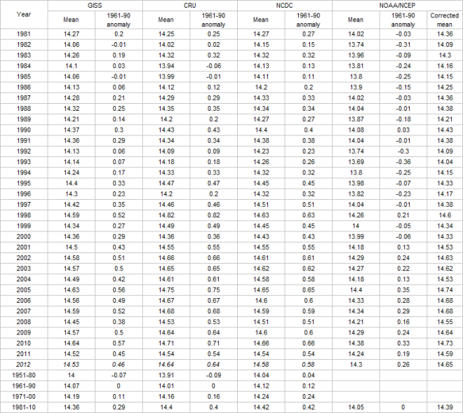
Annual mean values and anomalies for the three major databases, in comparison with the values calculated by the database grid points NOAA-NCEP used in this post. 2012 mean values, for the databases CRU, GISS and NCDC, refer to the period December 2011 – November 2012 and are shown in italics. The last column shows the NOAA-NCEP values “corrected” by adding the average difference in the 1981-2010 thirty years between the average of the other three databases and the average NOAA-NCEP, equal to 0.35 °C.
Let us note here that, in the past year, the CRU database has been slightly modified (see for example here), so some numerical values may slightly differ from previous assessments. In any case, the comparison reveals that, more or less, all databases are in agreement on the measurements and show the 2012 as warmer than the average of the most recent thirty years. On the other hand, the first year colder than period 1981-2010, for three databases on four, is the 2000 …, while to find the first year colder than period 1981-2010 for all four databases, it is necessary to go back to 1996!
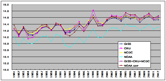
Annual average values for the three major databases, in comparison with the gridded values calculated by the database NOAA-NCEP used in this post.
However, beside the classifications, which can not be devoided by errors (observational, of average, station selection, interpolation, etc..), it is interesting to see how, if we take the ten-year period 2003-2012, it contains eight of the ten warmest years.
The signal is not present only at the surface: in fact, the map at 500 hPa (level corresponding to about 5500 m a.s.l., i.e. in the middle of the troposphere) shows values a bit smaller but still of the same sign, indicating that the warming occurred in the whole troposphere and not only of the surface stations (or of the boundary layer).
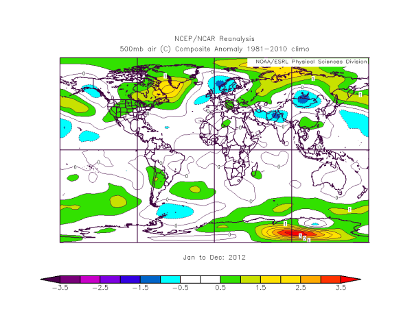
500 hPa temperature anomaly (°C) in 2012 with respect to the reference period 1981-2010. Data NOAA-NCEP.
Let us go now to examine the graphs related to individual seasons. The winter 2011-2012, which includes December 2011, shows a strong warming on the Arctic regions, with maximum values between Svalbards and Siberia larger than 16 °C, but is also great on Canada and the United States, while practically all the Central Asia (from Caspian Sea to Korea), West Africa and the areas around the Bering Strait show anomalies of -4/-5°C. Unlike the Arctic, however, Antarctica shows less significant and more varied values, and also part of Greenland has recorded temperatures below average.
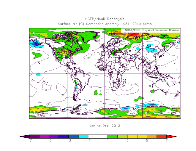
Surface temperature anomaly (°C) in 2012 with respect to the reference period 1981-2010. Data NOAA-NCEP.Surface temperature anomaly (°C) in 2012 with respect to the reference period 1981-2010. Data NOAA-NCEP.
Concerning the spring 2012, different warm areas are noticeable on the Antarctic mainland, while in the Arctic only the area above the Eurasia maintains strongly positive anomalies, in both cases with values of 6°C or more. Other hot spots are the United States and much of Europe, as well as north-western Asia and part of Greenland. Areas with strong negative anomaly practically do not exist, except for part of Alaska and a portion of Antarctic coasts.
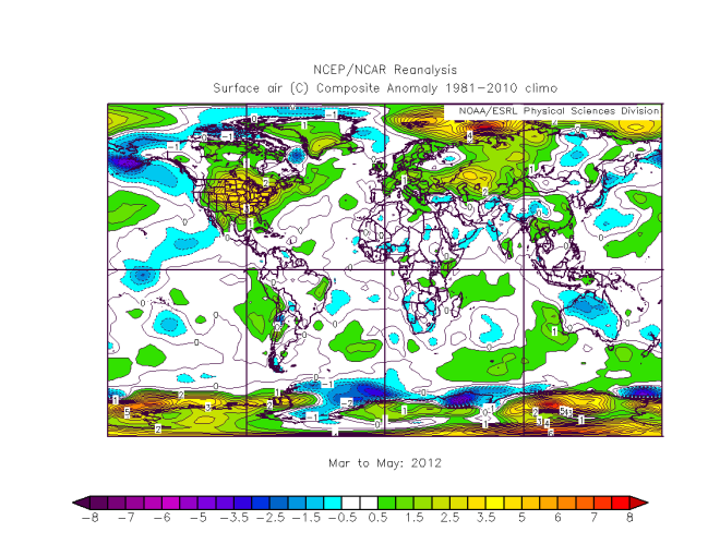
Surface temperature anomaly (°C) on the period March – May 2012 with respect to the 1981-2010 reference period. NOAA-NCEP data.
Summer 2012 is the season with the more moderated extreme anomalies. Almost the entire northern hemisphere has the land warmer than average, with rare exceptions (Great Britain and Scandinavia in Europe, and a small Siberian region over Mongolia in Asia), while in the southern hemisphere the oceans show more positive anomalies, and negative ones are present in the western parts of South America and Africa, and Australia. The most negative anomalies, however, are recorded on the Antarctic coastal areas, with values lower than -3°C, while inside there is the largest positive anomaly (more than 4°C).
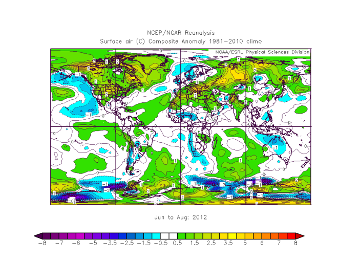
Surface temperature anomaly (°C) on the period June – August 2012 with respect to the 1981-2010 reference period. NOAA-NCEP data.
The fall 2012 shows a configuration with distinctly positive anomalies on Arctic areas (with maximum larger than 8°C and peaks of 10°C) and still positive on part of the continents in the northern hemisphere (except the region between Alaska and Canada and Central Asia) and Antarctica (with the exception of the Antarctic Peninsula and neighbour sea, which show the minima anomaly, lower than -4°C). In the southern hemisphere, there are some spots with slightly positive anomaly.
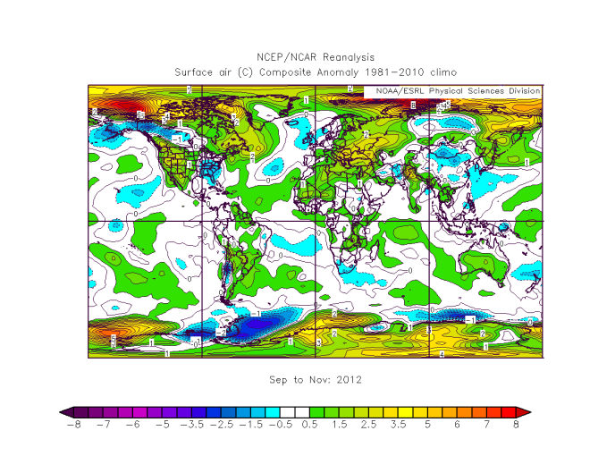
Surface temperature anomaly (°C) on the period September – November 2012 with respect to the 1981-2010 reference period. NOAA-NCEP data.
For completeness, we show also the image for the month of December 2012, which completes the analysis of the year, as the distribution of anomalies is singular. Obviously, being an average on only one month, the mean anomalies are larger. Northern America, Alaska and western Canada are colder than average (minimum around -5°C), while the eastern part, from the United States to Greenland, recorded positive anomalies of 2-3°C. In Eurasia, the areas close to the Arctic Ocean show very positive anomalies, over 10°C, while almost all continent, with the exception of Western Europe, and southeast Asia, show strong negative anomalies, with values between -5°C and -10°C. In the southern hemisphere, the anomalies are less noticeable: slightly negative in Argentina, Chile and Mauritania, and weakly positive in Brazil, South Africa, Australia and Ethiopia; positive, with peaks larger than 5°C over most of Antarctica.
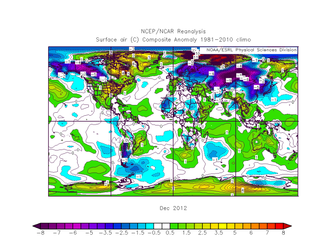
Surface temperature anomaly (° C) on the month of December 2012 with respect to the 1981-2010 reference period. NOAA-NCEP data.
Let us now look in more detail the situation on the European continent. Apart from the Arctic (where anomalies exceeded 6°C), we see that the whole Europe, with the exception of Portugal, Great Britain, Scandinavia, Baltic States and a small piece of Russia, was under a positive anomaly, albeit lower than 2°C. The hottest areas include south-eastern Italy, Greece, Romania, Bulgaria, the Black Sea and a strip between Armenia and Azerbaijan.
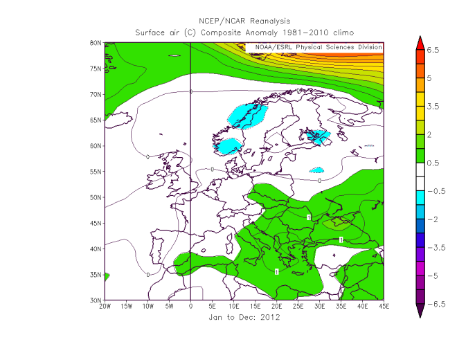
Surface temperature anomaly (° C) on the period December 2011-February 2012 with respect to the 1981-2010 reference period. NOAA-NCEP data.
It is interesting, in this regard, to see also the map of the anomalies of geopotential height at 200 hPa (hereinafter called Z200), a level typical of the lower stratosphere. The graph shows a good correspondence between the positive thermal anomalies of temperature and those positive of Z200, while the negative anomalies of Z200 match with null or slightly negative anomalies of temperature.
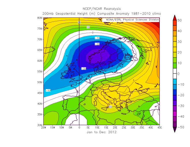
200 hPa geopotential height anomaly (in m) relative to the period December 2011-February 2012 with respect to the 1981-2010 reference period. NOAA-NCEP data.
This finding can also be generalized to a global scale, as the good symmetry between the map of thermal anomaly at ground level and that of the Z200 is still evident. These maps visualize the correlations between tropospheric and stratospheric circulation, not yet fully understood in their details but under study (among others, I cite this 2007 paper in which Cohen et al. discuss the events of interaction between the stratosphere and troposphere in the extratropical regions).
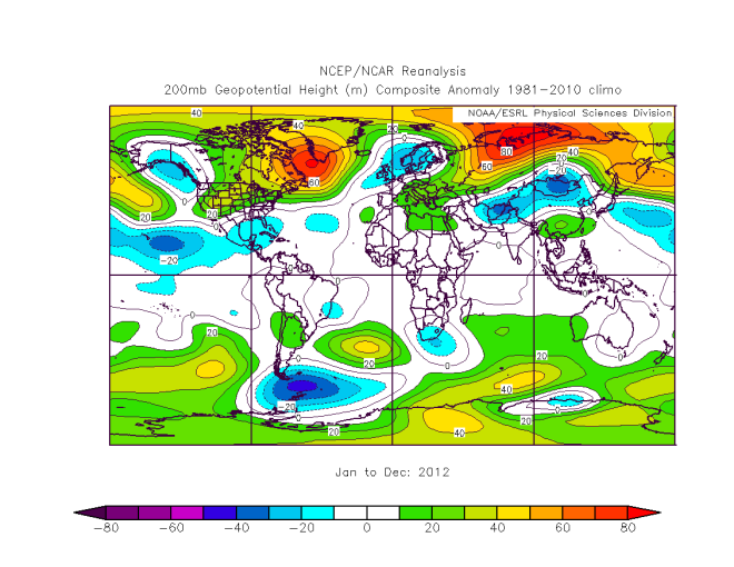
200 hPa geopotential height anomaly (in m) relative to the period December 2011 – February 2012 with respect to the 1981-2010 reference period. NOAA-NCEP data.
Recently, the National Oceanic and Atmospheric Administration (NOAA) said that, in the continental 48 states of the US, 2012 had an average temperature of 55.3°F (12.9°C), which eclipsed 1998, the previous record holder, by 1°F (0.55°C). The 1°F difference from 1998 is an unusually large margin, considering that annual temperature records are typically broken by just tenths of a degree Fahrenheit. In fact, the entire range between the coldest year on record, which occurred in 1917, and the previous record warm year of 1998 was just 4.2°F.
Let thus see a map centered on the US: the anomaly here tops to more than 3°C between Nebraska and Kansas, and the isotherm 1.5°C contains most of the US.
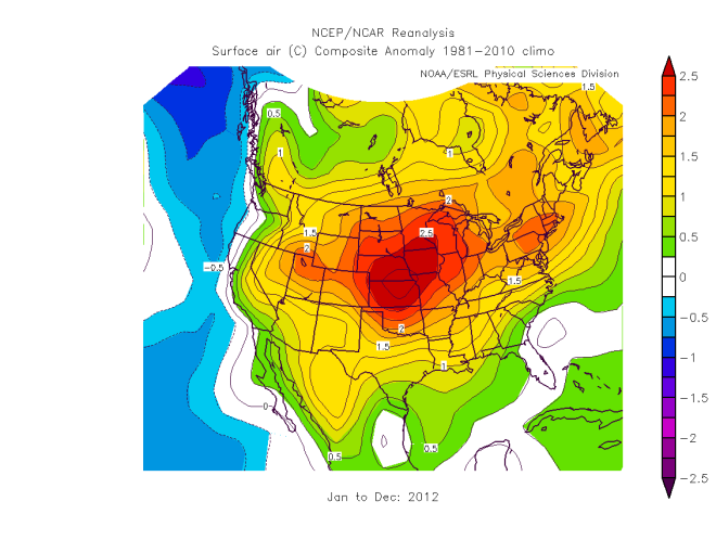
Surface temperature anomaly (° C) on the period December 2011-February 2012 with respect to the 1981-2010 reference period. NOAA-NCEP data.
Now we would see some zooms in some meteorologically interesting periods. The year that has just ended was characterized, overall, by a series of significant weather phenomena. Among others, Italians remember the intense cold wave in first half of February (with extreme thermal values not seen since 1985-86 and, in some areas, heavy snowfalls also in the plains, that created serious problems), the very hot and dry summer in central and southern Italy (probably the warmest of the last 100 years, maybe second only to that of 2003) and the moderate cold wave in early December, which put an end to a long period of above-average temperatures.
Let us start from the first two weeks of February 2012. The thermal maps show Europe completely covered by a negative anomaly (except for part of Scotland and Ireland, and Iceland), with very low values: -12°C. In Italy, the North was the most abnormally cold zone, with values below the average of 7.5-10.5°C, while moving Southwards, the anomaly, even if negative, becomes less conspicuous. Notice also how the mitigating effect of the Mediterranean, who entered in the 2011 winter with temperatures well above average, such as to favors some flooding episodes and even the generation of a Mediterranean hurricane (medicane: see here) near Corsican coasts, was almost absent in the western part.
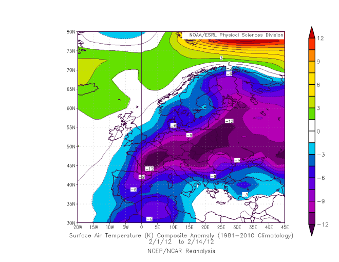
Surface temperature anomaly (°C) on the period 1 – 14 February 2012, compared to the 1981-2010 reference period. NOAA-NCEP data.
Also some Asiatic regions have experienced cold weather at the beginning of the year. The map of the anomalies in the first two months shows a sort of bipolar situation, with a large negative anomaly over most of central and southern Asia, with the exception of the extreme southeast, and another huge and large positive anomaly over Siberia and Arctic sea. It appears as the cold air was displaced southwards of its natural position, and also in this case the map of the Z200 anomaly (not shown) presents some similarities.
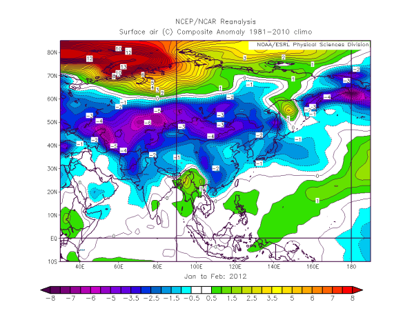
Surface temperature anomaly (°C) on the period January – February 2012, compared to the 1981-2010 reference period. NOAA-NCEP data.
Coming again to Europe, we continue with the warm months: the anomaly map shows a dipolar situation over Europe, with the northwestern part of the continent cold and the rest under the influence of a heat wave that, in Italy, recorded 1.5-2°C above average over the Adriatic regions, and values less than 1°C over the Alps (on this site there are some additional consideration on Italian summer). The most striking positive anomaly was recorded in a narrow strip of land included between Romania and the Black Sea.
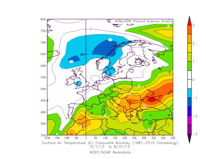
Surface temperature anomaly (°C) on the period May-August 2012 compared to the 1981-2010 reference period. NOAA-NCEP data.
Finally, we analyze the situation that characterized the other, most moderate, cold spell of the year, recorded in the first two weeks of December. As in the previous case, the 0°C isotherm contains almost all Europe, except the southern part and the Mediterranean.
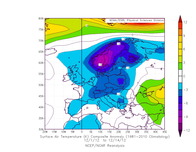
Surface temperature anomaly (°C) on the period 1 – 14 December 2012 compared to the 1981-2010 reference period. NOAA-NCEP data.
Concerning the rest of the world, everybody remembers the Hurricane Sandy, which flooded entire districts of New York; or the drought in the U.S.; or the extensive flooding caused by tropical cyclones in Madagascar and the Philippines. Fewer people instead remember the Hurricane Nadine, which did not cause serious damages, but stationed off the Azores for over twenty days with the status of a hurricane, going round and round in these parts, and double-tapping islands and giving some concern to meteorologists who feared its explosive entrance in the Mediterranean, fortunately not occurred. Born on Sept. 7, and died on October 4, with its 23 days of life as tropical, subtropical and post-tropical cyclone, of which 21.75 as a tropical/subtropical system, Nadine is ranked as the fifth long-lived hurricane of the history.
Look at the map of the anomalies of sea surface temperature, we can see that, particularly during the period in which Nadine flew over the Atlantic, the anomalies became negative, sign of the potent activity of water mixing carried by the Nadine winds. That is why fishermen, in tropical areas, usually do not fear, but rather wait, and hope, the hurricanes, whose mixing effect cools the surface waters, favoring the fish abundance.
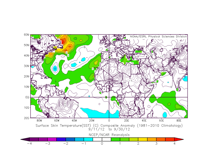
Sea surface temperature anomaly (°C) on the period 15 – 30 September 2012 compared to the 1981-2010 reference period. NOAA-NCEP data.
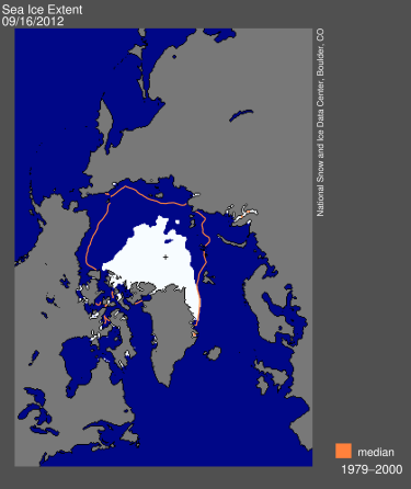
Worldwide, the 2012 reserved another resounding record: the marine Arctic ice cap has shrunk as never before in recent decades (see this post by Real Climate): the minimum area occupied by marine ice at the North Pole was only 3.41 million square kilometers, value smaller than one half the average of the last two decades of the twentieth century! Climatologists know well the ice-albedo positive feedback, one of the most important ones. Let us see, therefore, if it is possible to find a direct effect of this anomaly of Arctic marine ice cover on its surface temperatures (SST). Well, the answer is positive: the actual area free of ice is the one that shows the most noticeably positive thermal anomalies, more than 4°C, with a peak of more than 7°C near the islands of Novaya Zemlya. Without detailing here hypotheses that still need further evidence, however, it is impossible to not underline that the ice-free horseshoe structure that, in September, surrounds the Greenland, is also present in the SST thermal anomalies, and has also an impact on the field of sea-level pressure anomaly, whose maxima are shifted on the continents.
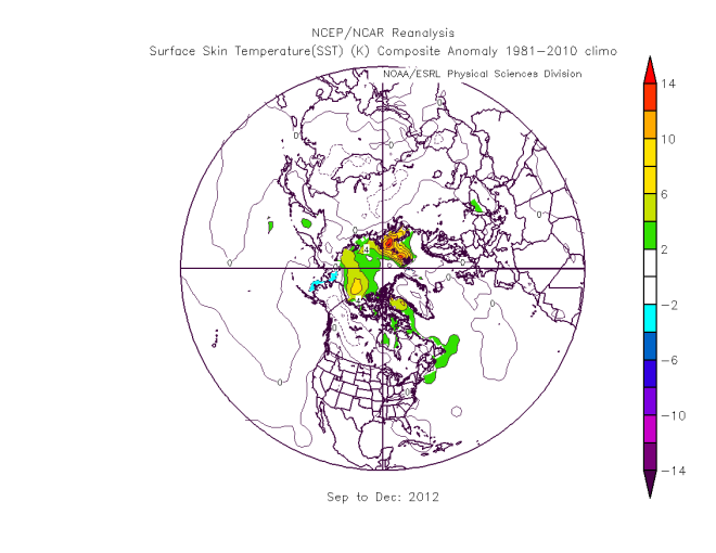
Sea surface temperature anomaly (°C), related to the period September-December 2012 and compared to the 1981-2010 reference period. NOAA-NCEP data.
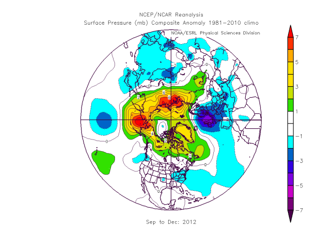
Surface pressure anomaly (hPa) related to the period September-December 2012 and compared to the 1981-2010 reference period. NOAA-NCEP data.
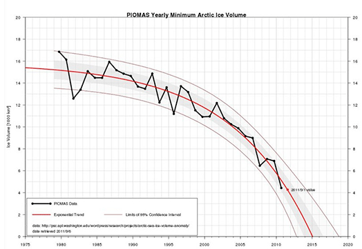
The fear, in this case, is that the scientific findings will be later than the disappearance, in September, of the Arctic sea ice. As it is can be seen below, it may be possible that this fact could happen as early as within 4-5 years …
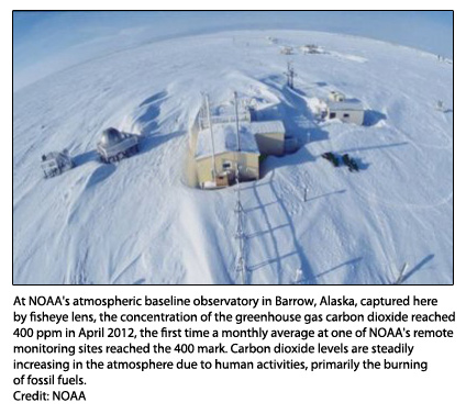
Last, but not least, we will report another record in 2012. At the remote meteorological station in Barrow, Alaska, for the first time the monthly averaged atmospheric CO2 concentrations exceeded the threshold of 400 ppm (parts per million – that is, over a million molecules of air, more than 400 are CO2) in the months of April and May. We would like to stress that Barrow station is remote, i.e. away from CO2 sources able to influence the measurements. The threshold of 400 ppm is purely psychological, and probably, less than three years later, also the global average will exceed it; however, this figure represents a signal that can not be overlooked, especially considering that other greenhouse gases such as methane, are increasing and every year set a new record of concentration.


Pingback: 2012 global temperatures: still in medal zone! | Climate facts and opinions
I am also suggesting to see this short movie: http://www.youtube.com/watch?feature=player_embedded&v=u_0JZRIHFtk
Thank you, Claudio, for your accurate analysis